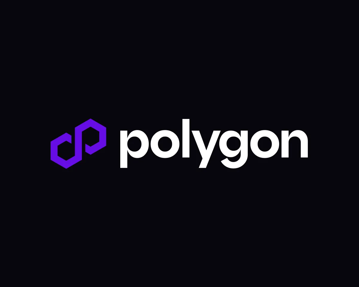
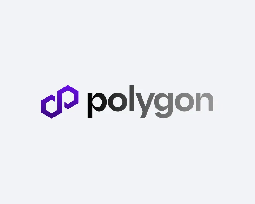
The iconic Polygon logo


Polygon logo
When possible, use the full lockup that consists of the logomark and wordmark together.
The logo comes in 4 color variations for various backgrounds to ensure proper fidelity.
To ensure readability and legibility of the logo, the lockup shouldnot be used at sizes below 112px or 25mm width.


COPY PNG
copy svg

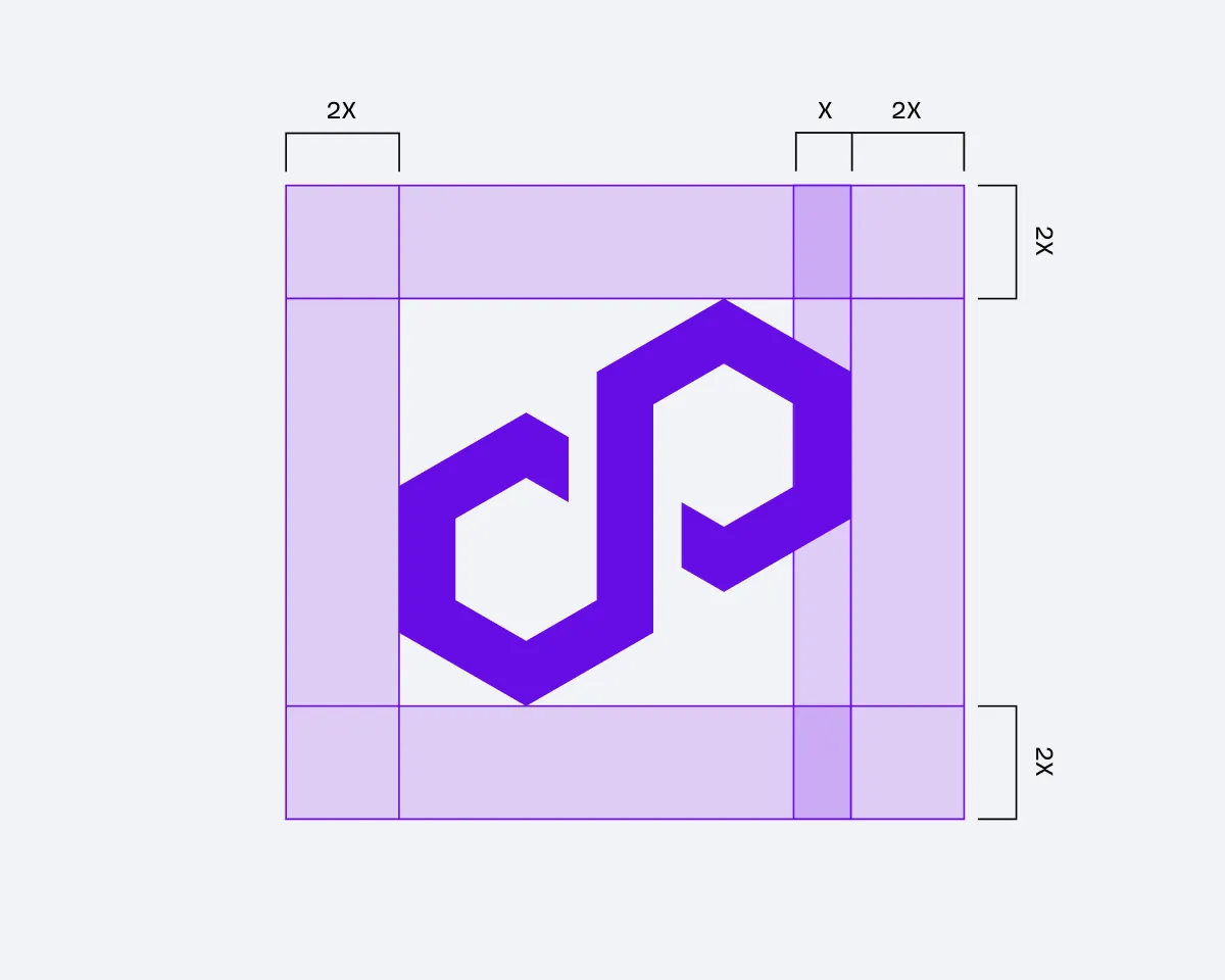
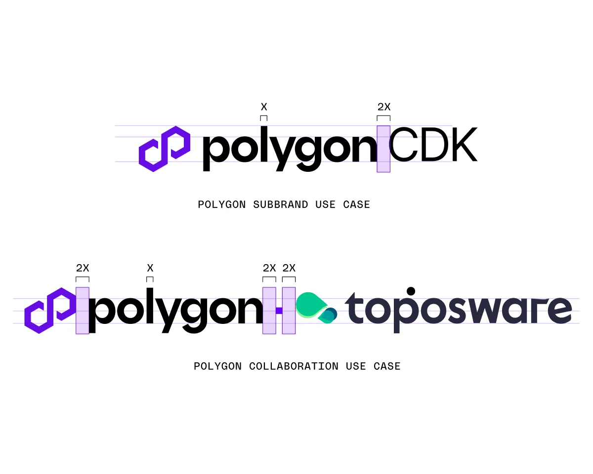
Construction
Maintain the clear space around the logomark to ensure legibility at all scales.
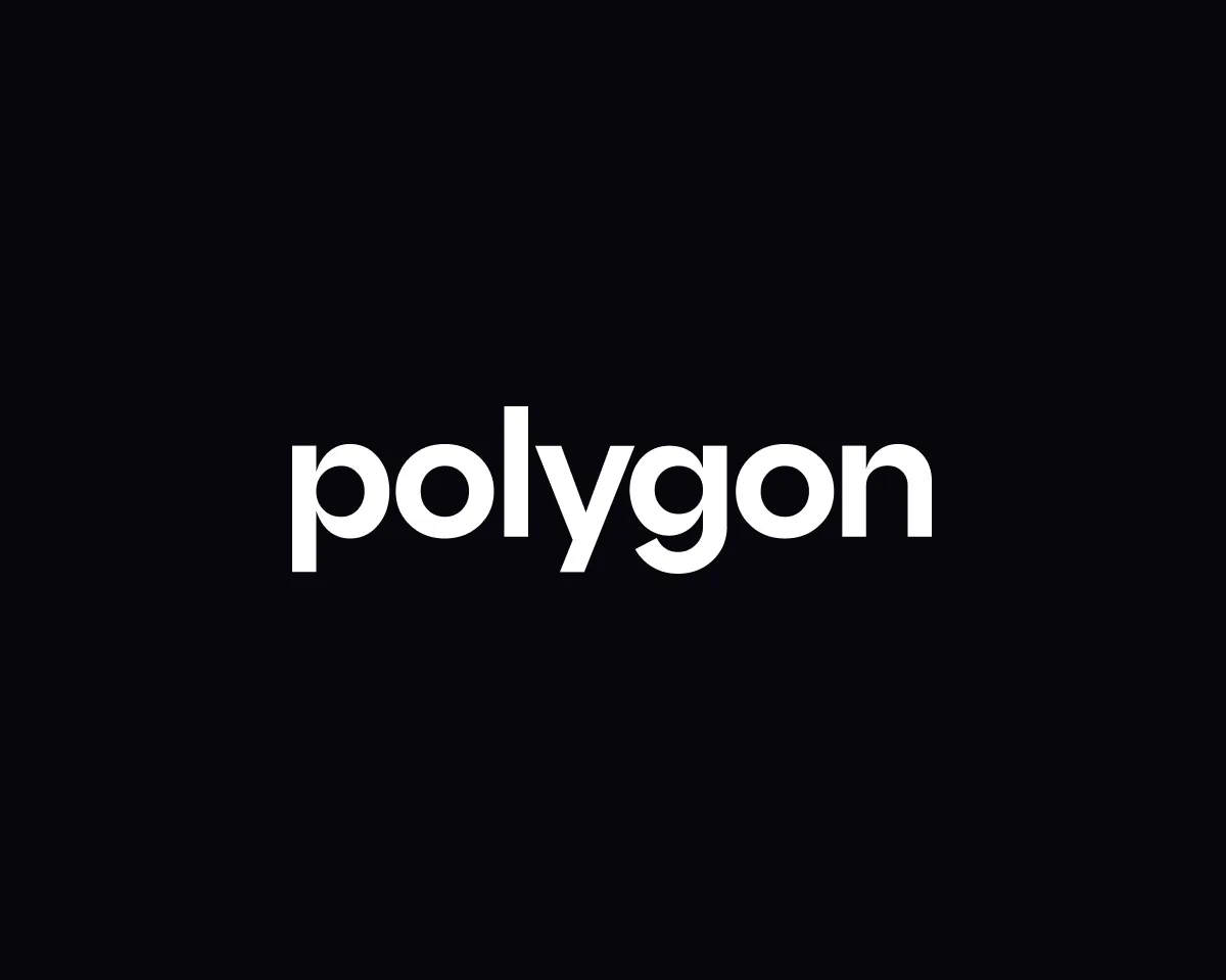
Wordmark
However, the wordmark has been optically adjusted to ensure an even rhythm between the letters. Always use the approved wordmark instead of typing out the name of the company.
The wordmark is generally not used without the logomark.
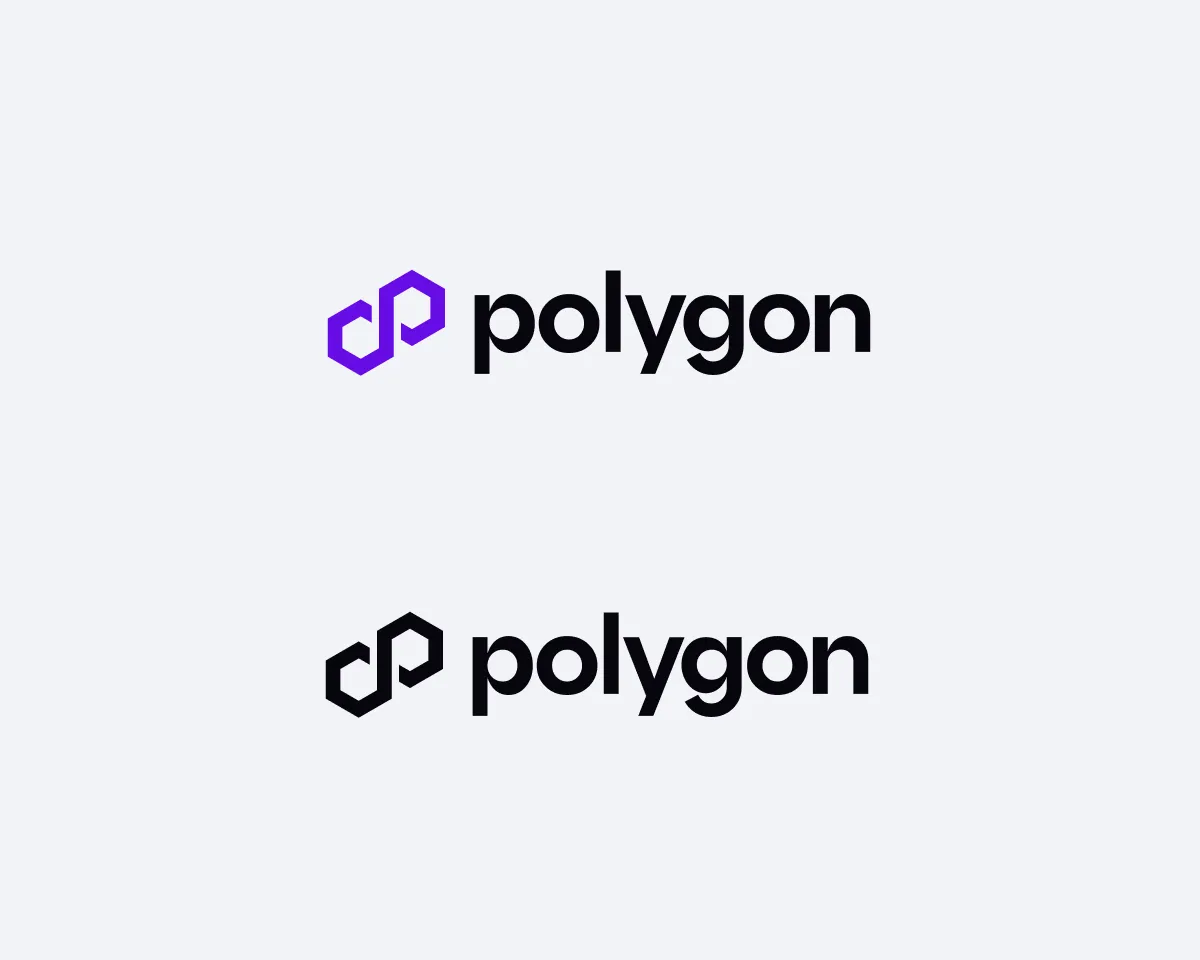
Logos in light mode
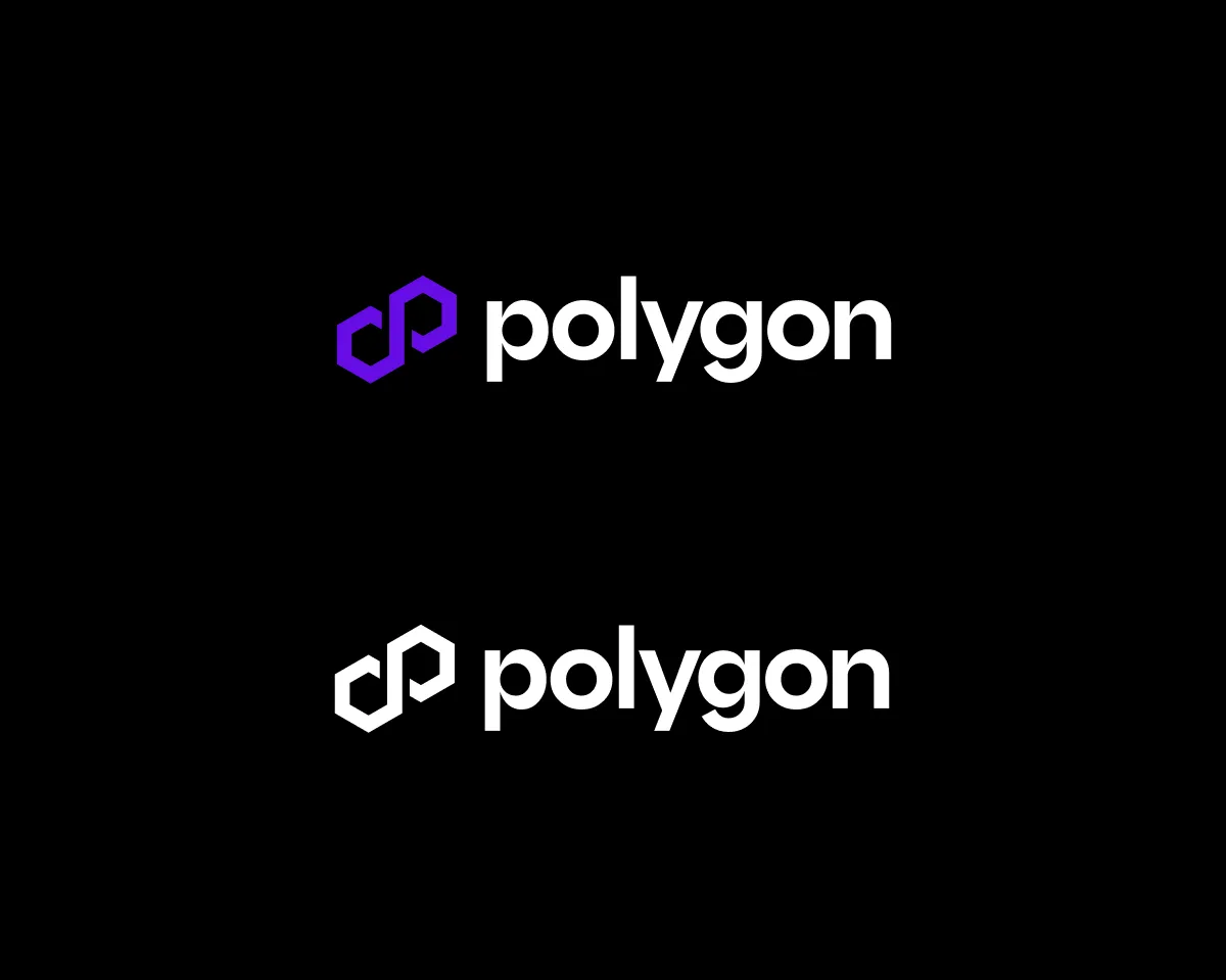
Logos in dark mode
Logo in partnerships
When Polygon logo appears alongside other partners’ logos, maintain a minimum clearance space between each logo as outlined here.
Avatars and icons
The icon is only available in our core palette of purple, black or white, and no other combination of colors.
Don’t
For consistency and legibility, our logo shouldn’t be altered in any way.

Don’t alter the colors of the logo
Don’t stretch, squeeze or rotate
Don’t apply gradients or multiple colors
Don’t apply effects or shadows
Don’t add strokes or outline
Don’t put the logo in a container or frame